
This is my journey of developing a visual identity for a rapidly growing tech company.
My role: Brand designer
Duration: 2 Months (for brand establishment), work ongoing for 3.5 Years
Tools: Adobe Ai, Ps, Id
Stakeholder: Auto1 Group Managing members; Communications, Design and Marketing Directors

1- Objective
The objective of this case study is to examine my process of identifying the essence of AUTO1 and providing the graphic elements that allowed the brand to grow cohesively and in line with its essence.
Action
Developed key insights from an audit. As a result of these ideas, the first brand guidelines were developed and the visual identity was designed.
Challenge
Identifying the essence of the company, revisiting and honoring what has already been built, and developing something new from that.
Result
The company’s visual identity grew consistently across departments. Additionally, designers had access to libraries and resources.

2. Design process
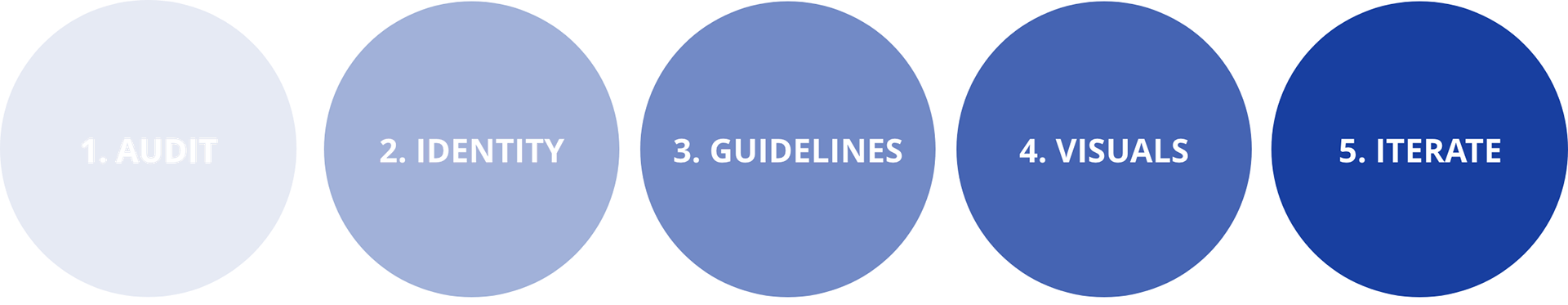
Before designing the brand's identity, I conducted a Brand Audit to understand how the company and its collaborators perceive it. By identifying its essence, a visual representation for the different departments was created, working with the team to maintain a consistent look and feel.
3. Research
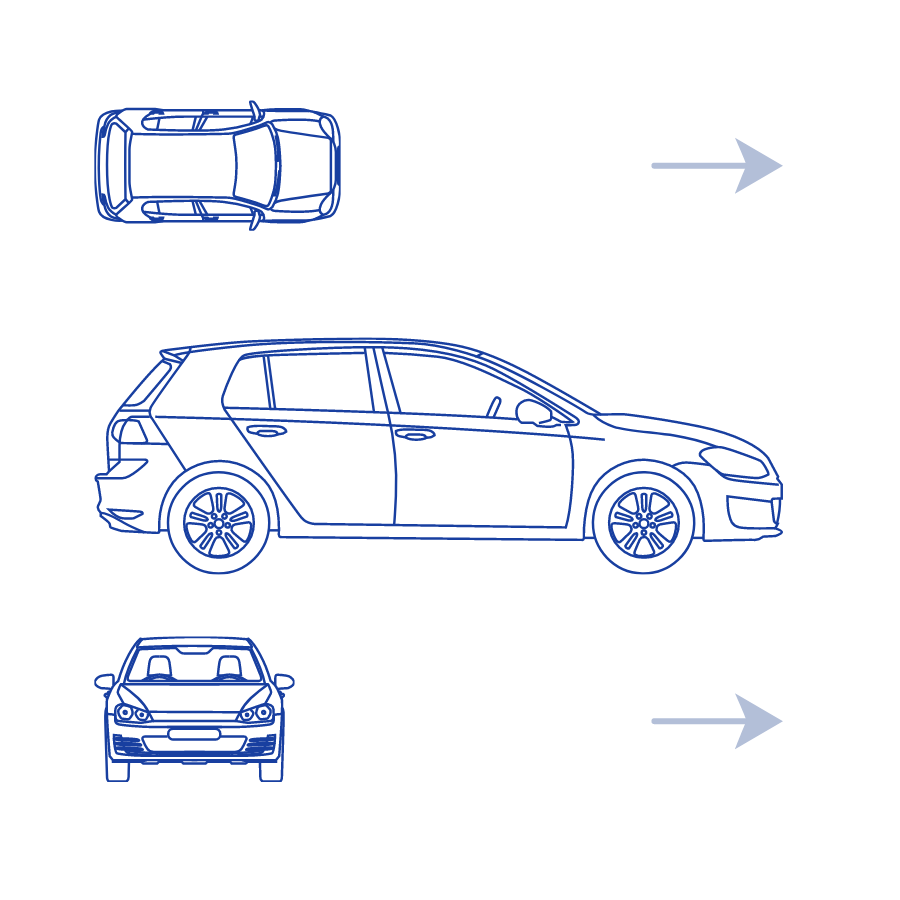
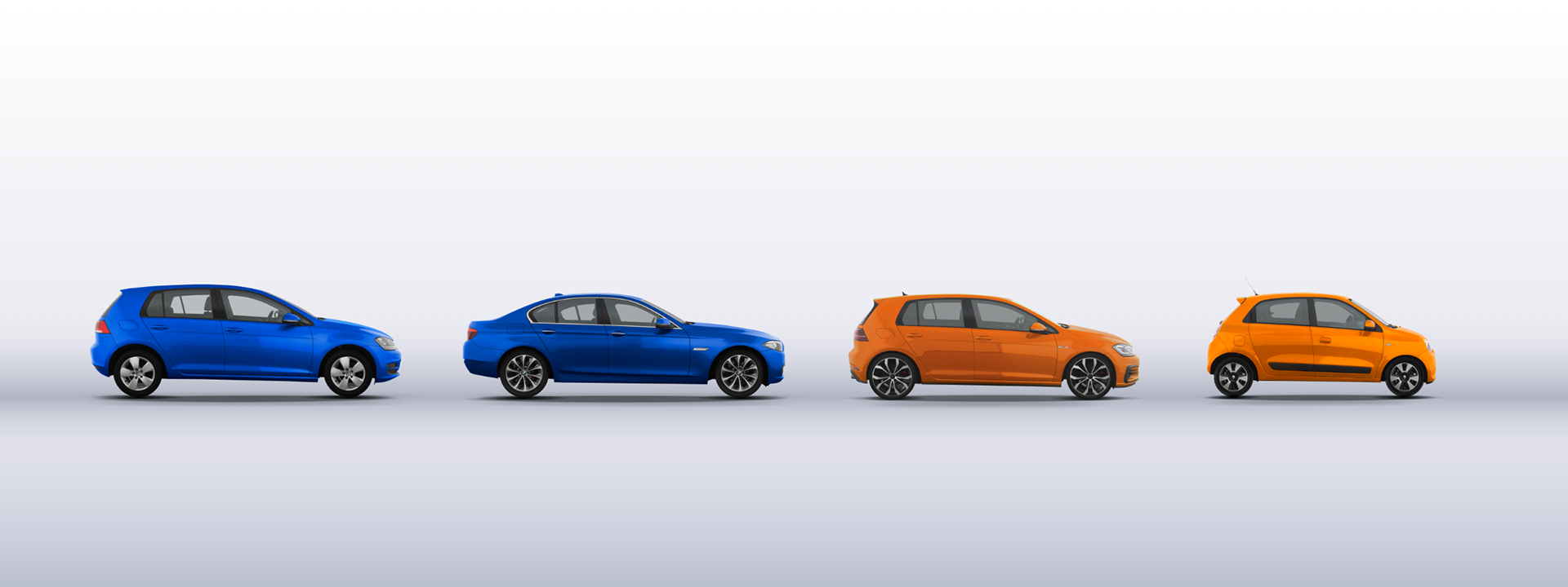
I analyzed car brands and car trading platforms to understand how AUTO1 was positioning itself against those, as well as what aspects could serve to make it stand out. Global car brands are represented on the left side, while digital platforms for car transactions are shown on the right side.
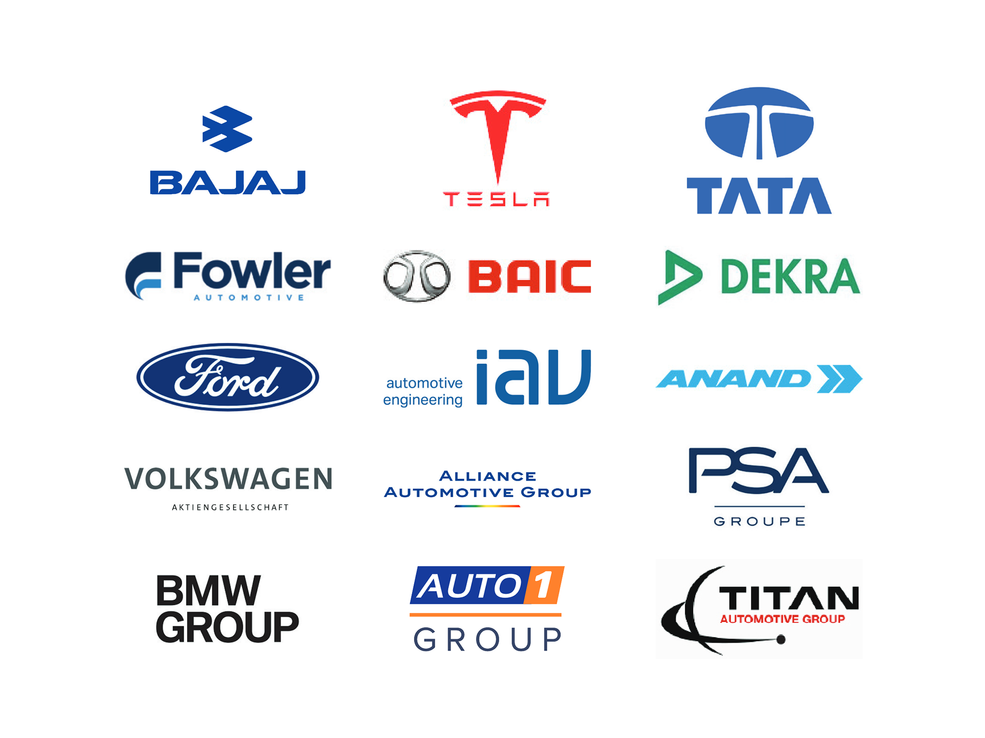
Auto companies
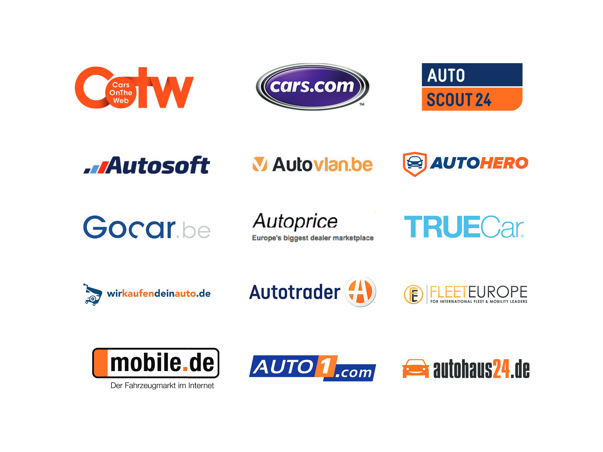
Marketplace companies

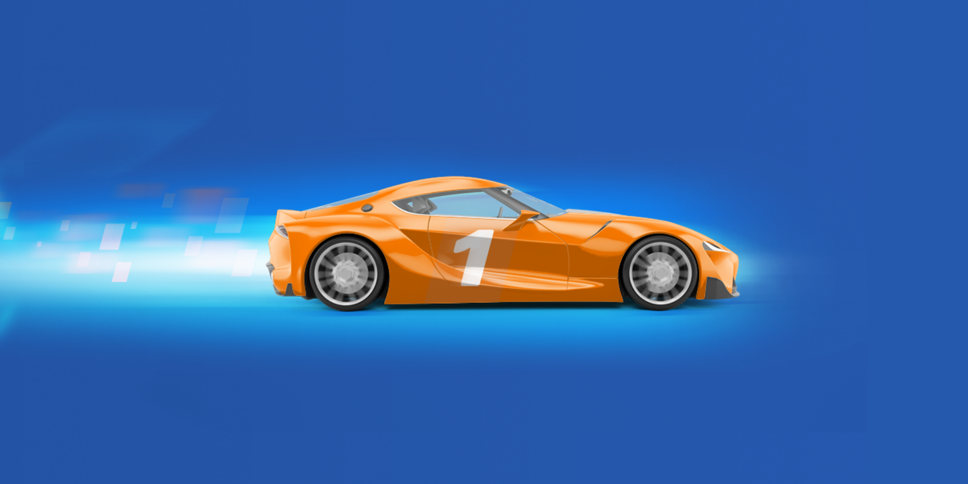
2. Brand Identity
Based on the words "AUTO" and "1", I derived the concepts that helped me represent the essence of the brand. AUTO: A symbol of mobility powered by technology. For this analogy, I compared highways and cardboard circuits. ONE: It embodies how an international company with people from diverse backgrounds collaborate to achieve one goal: "One vision, One team".

asjcnaljskncxakljs

cas.malskcmlaksc
Logo proposals
My audit led me to develop several logo proposals that I thought captured the essence of the company. Additionally, I thought they offered versatility across a variety of platforms. Concepts, mockups, and potential application possibilities were presented.
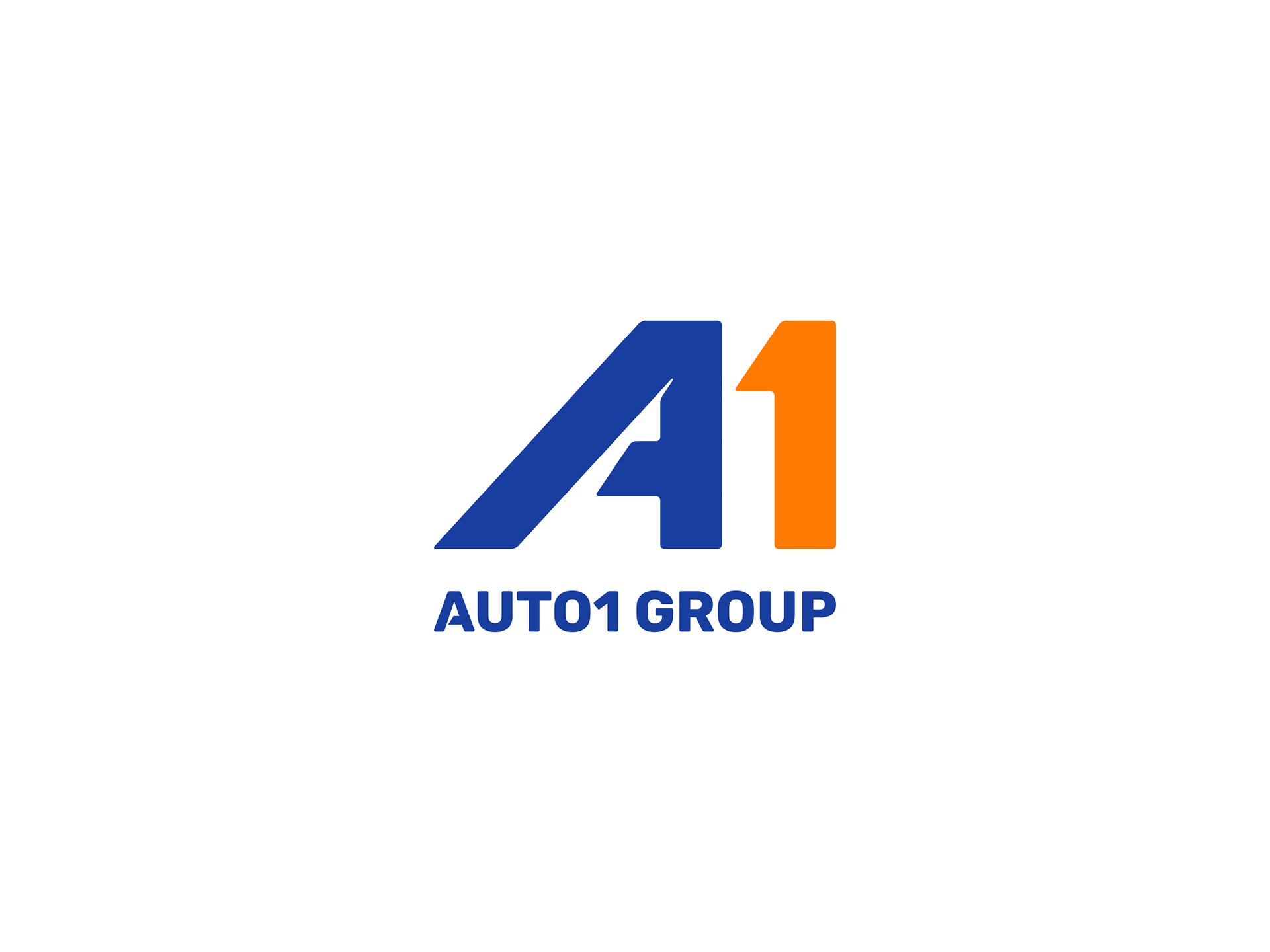
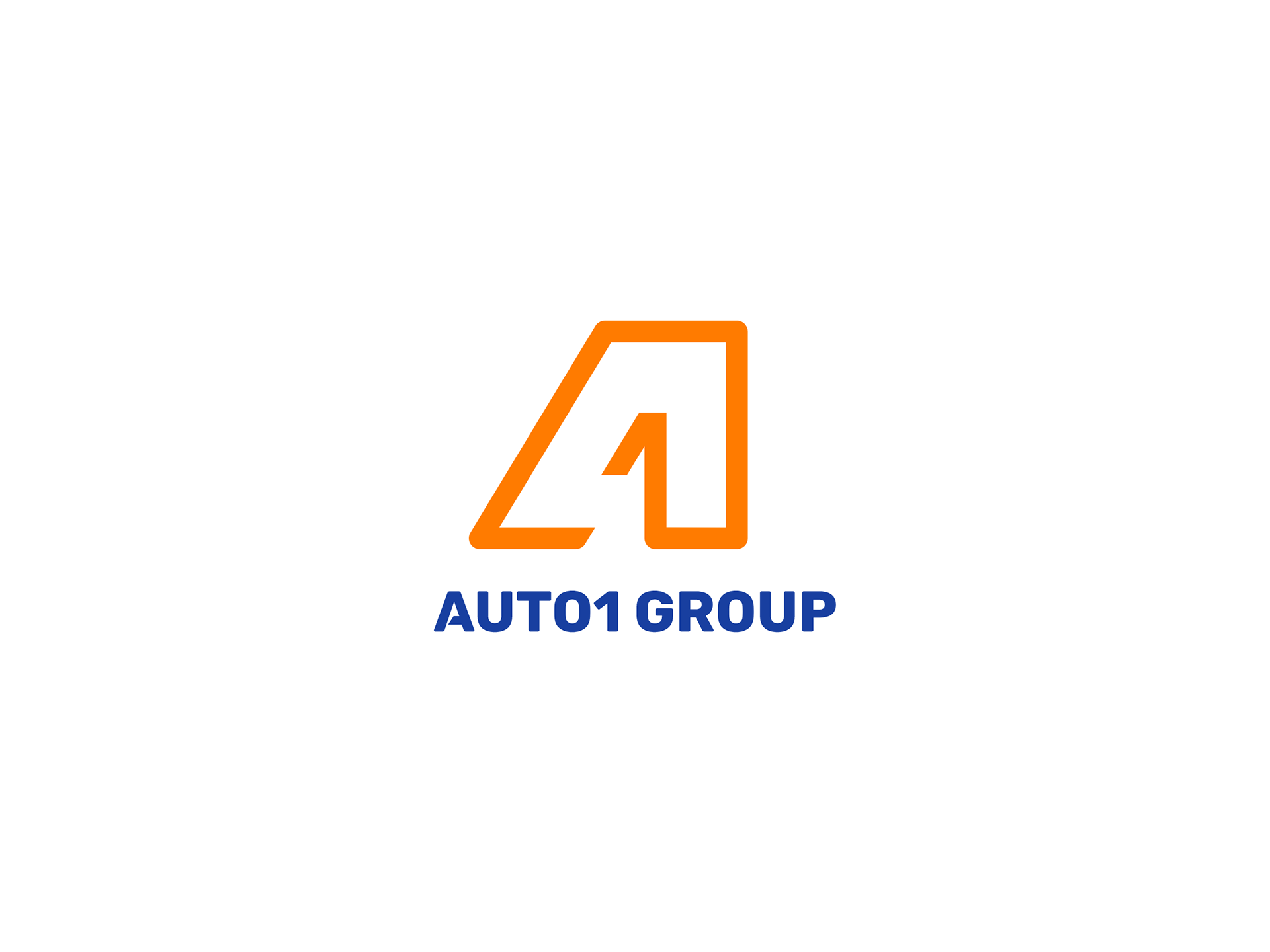
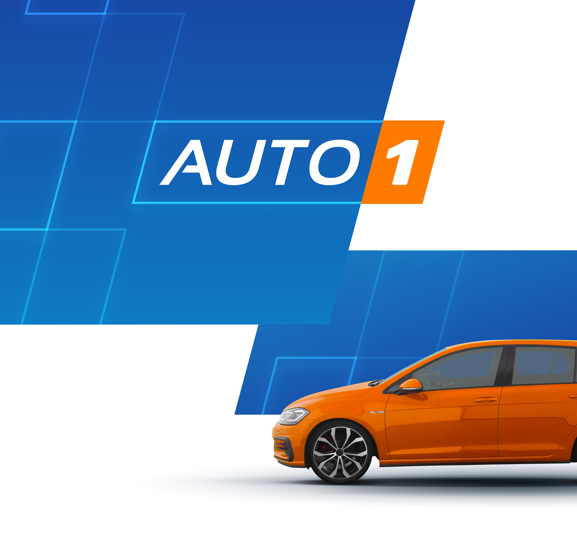
In the end, it was decided not to go ahead with changing the logo, and the only official request that was made was to improve the existing logo.
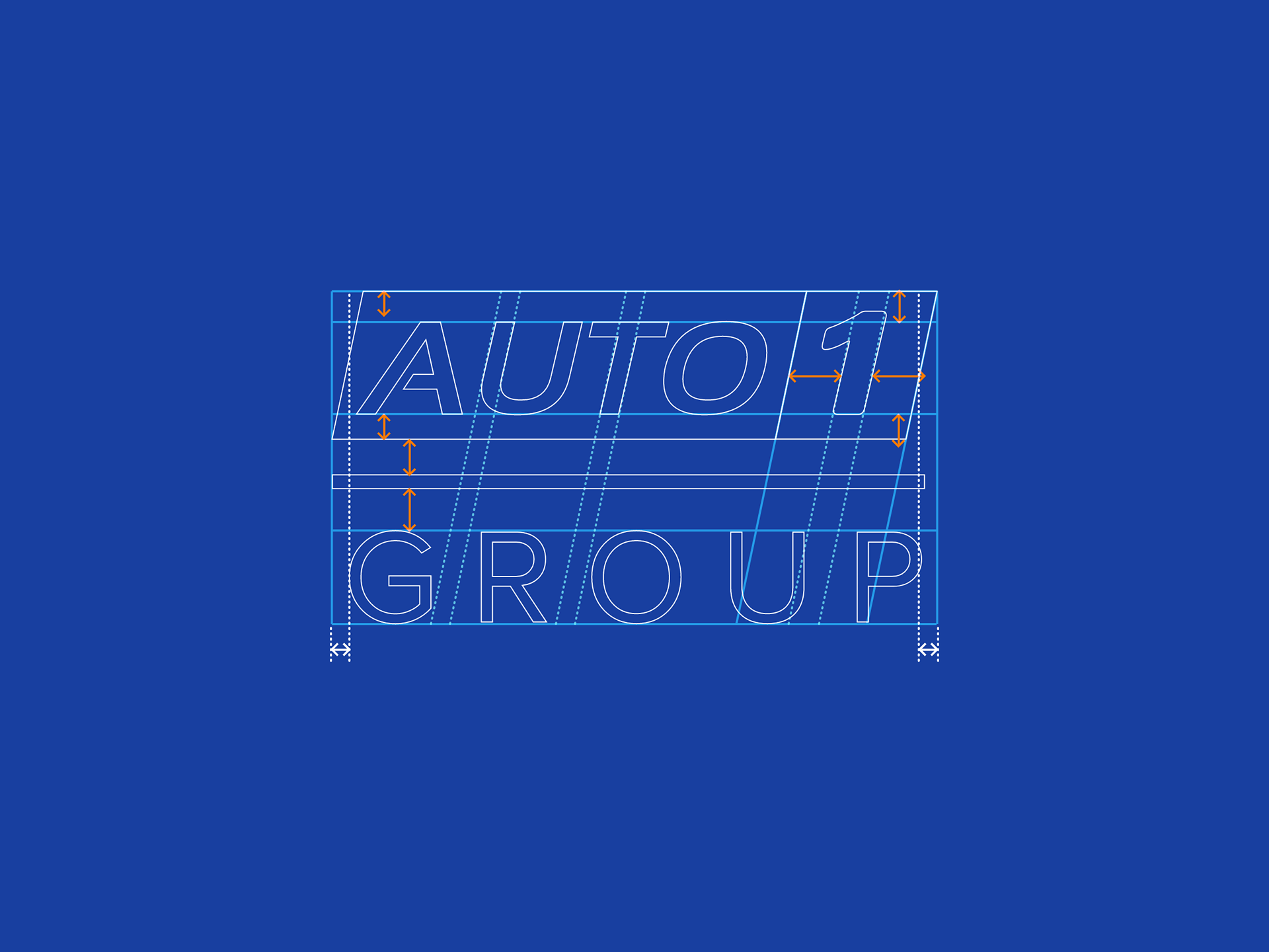
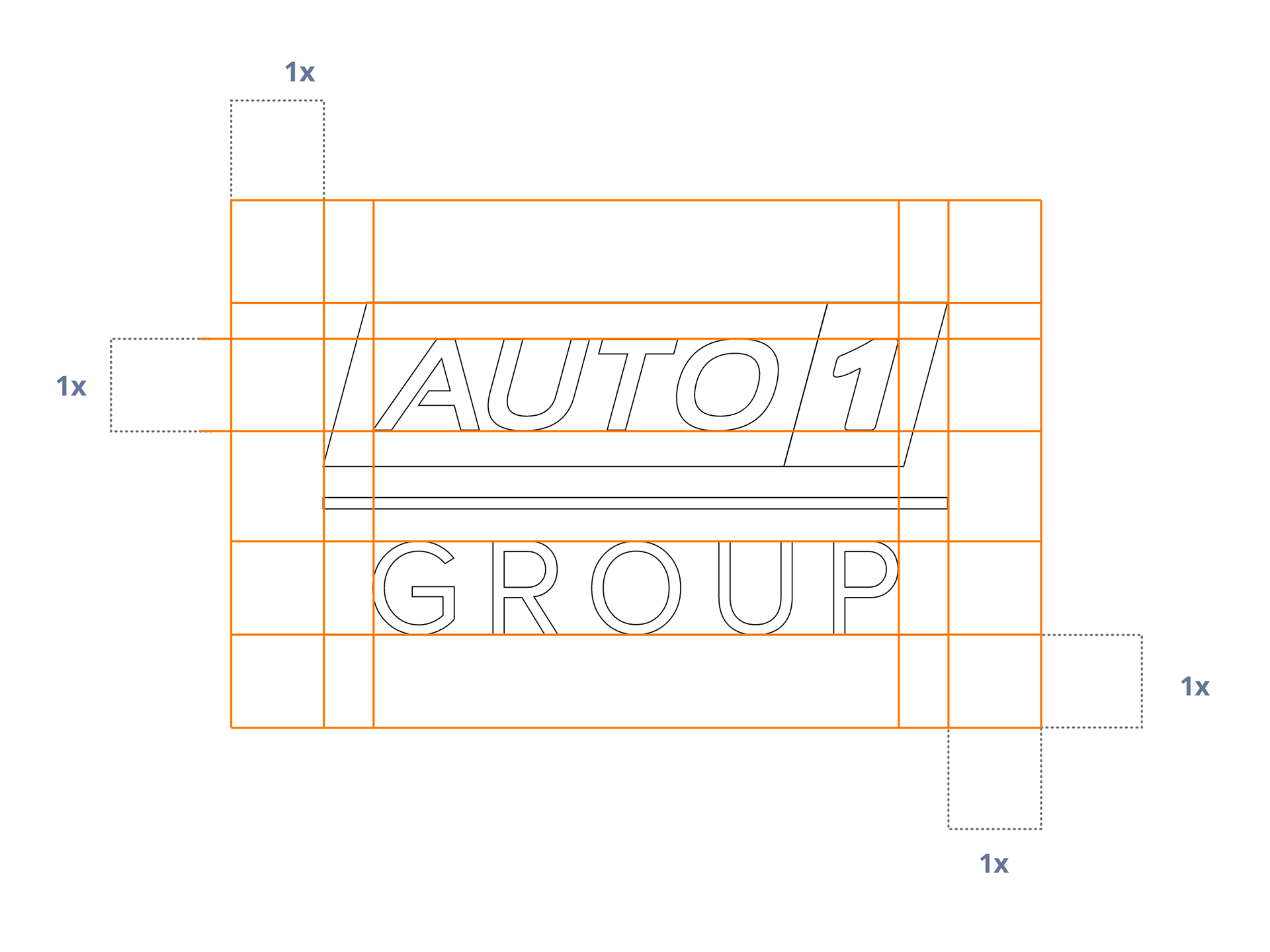
Logo adjustments
I refined the original logo and made a few technical adjustments to ensure it is balanced and proportional, while ensuring that its essence remains intact.

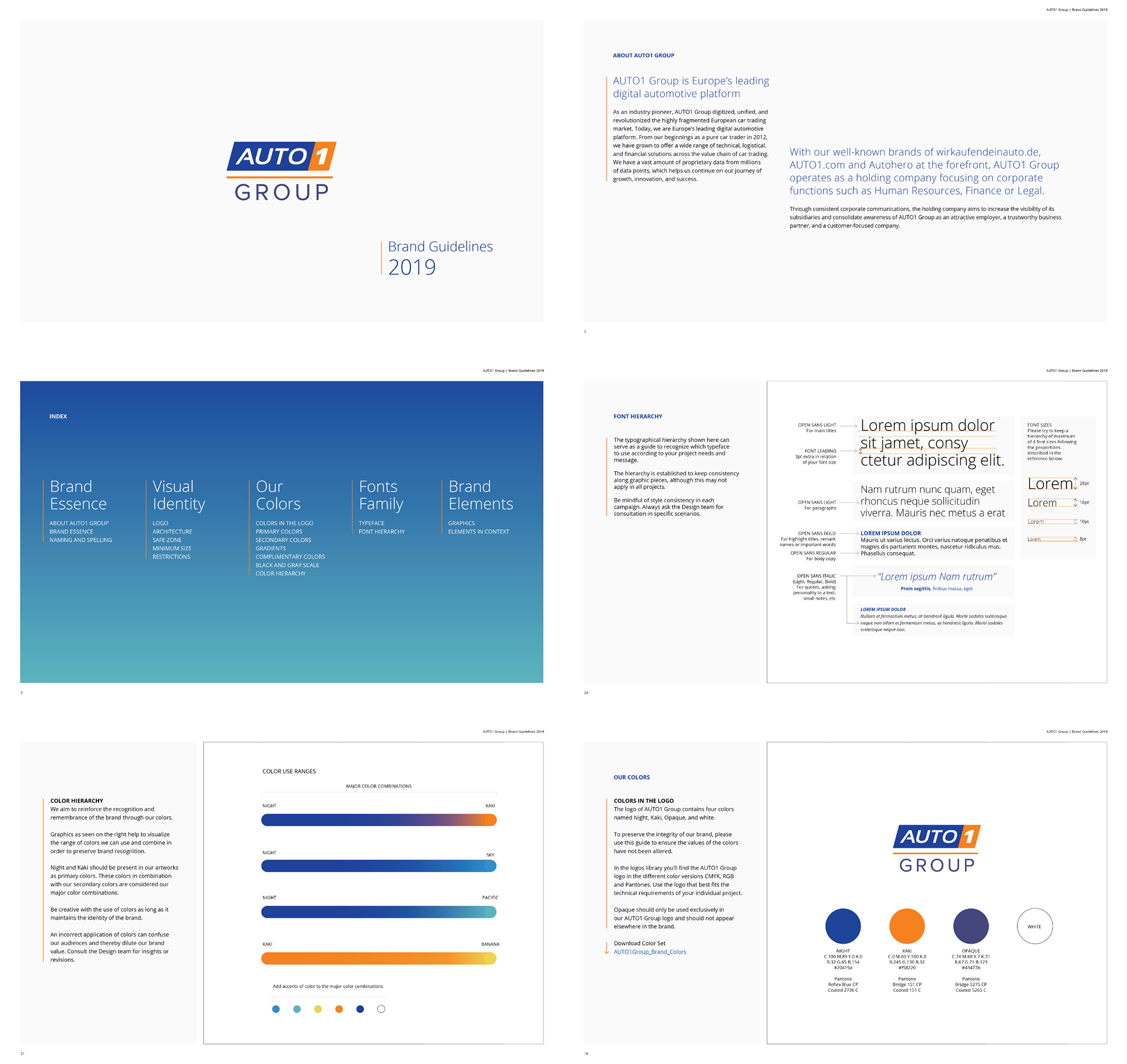
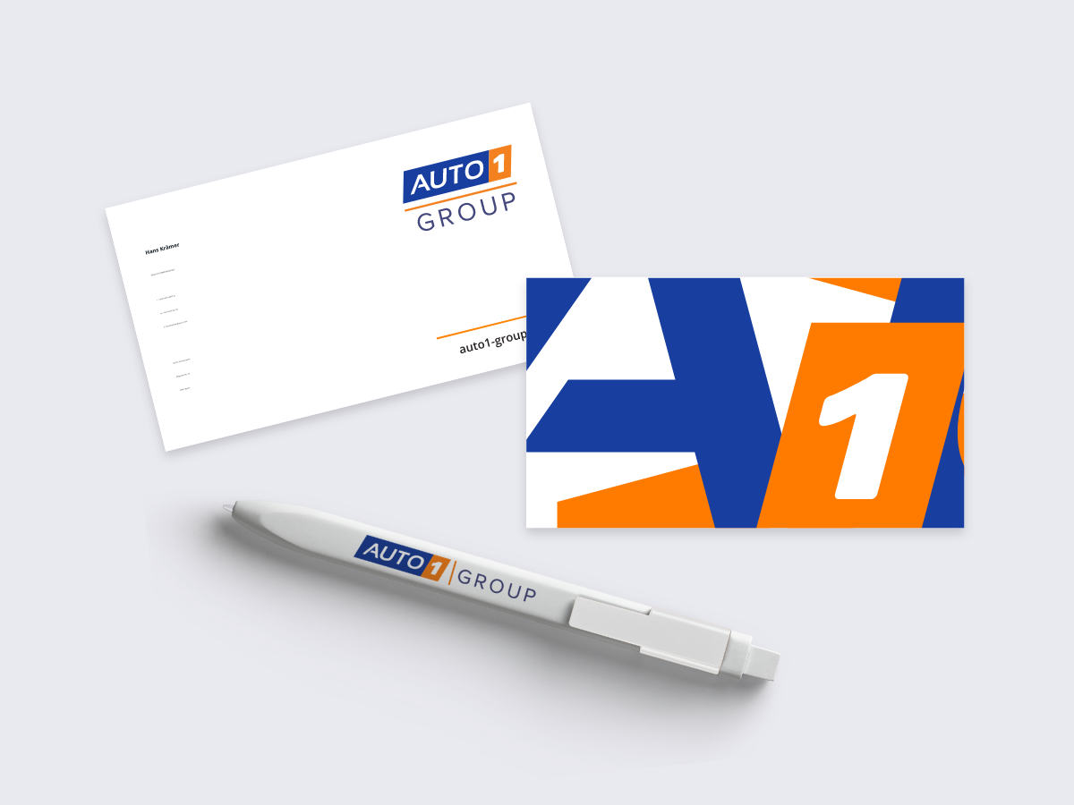
3. Brand guidelines
In order to develop the brand visually, several explorations of layout, logo placement, font families, and color schemes contributed to the first version of the Brand guidelines.
Logo


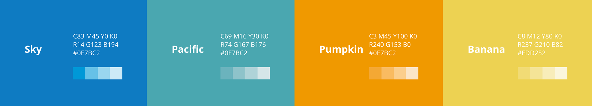
Color scheme
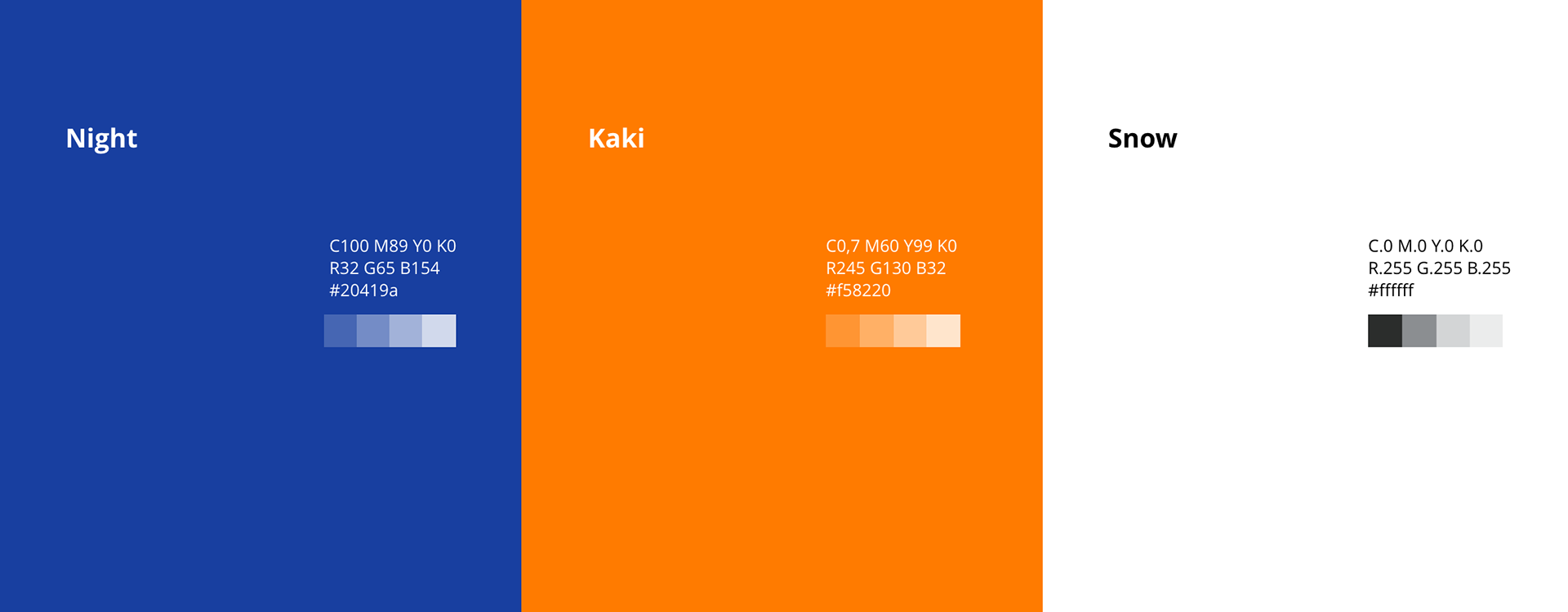
Primary colors

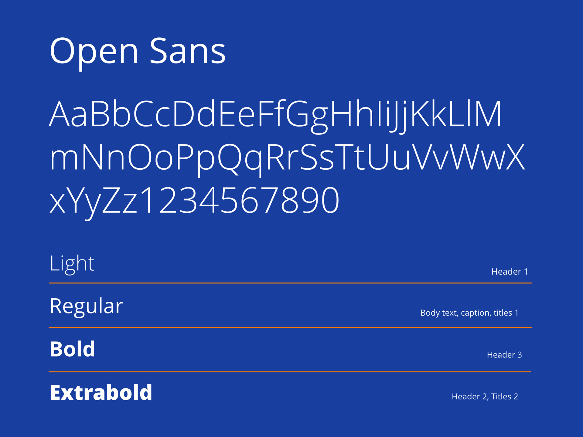
Font family
Brand recognition
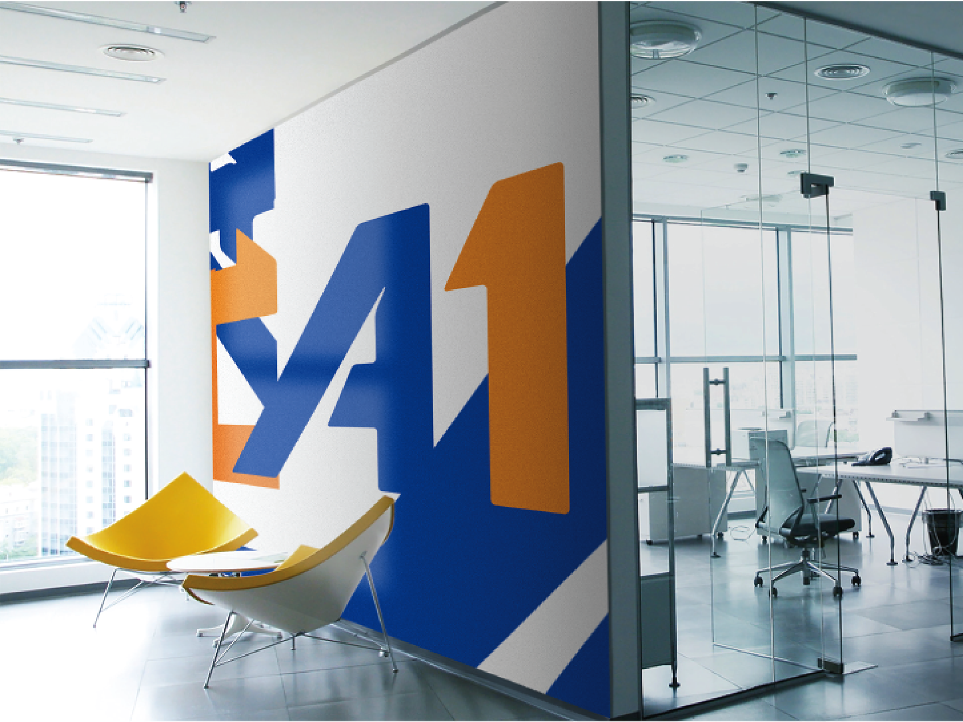
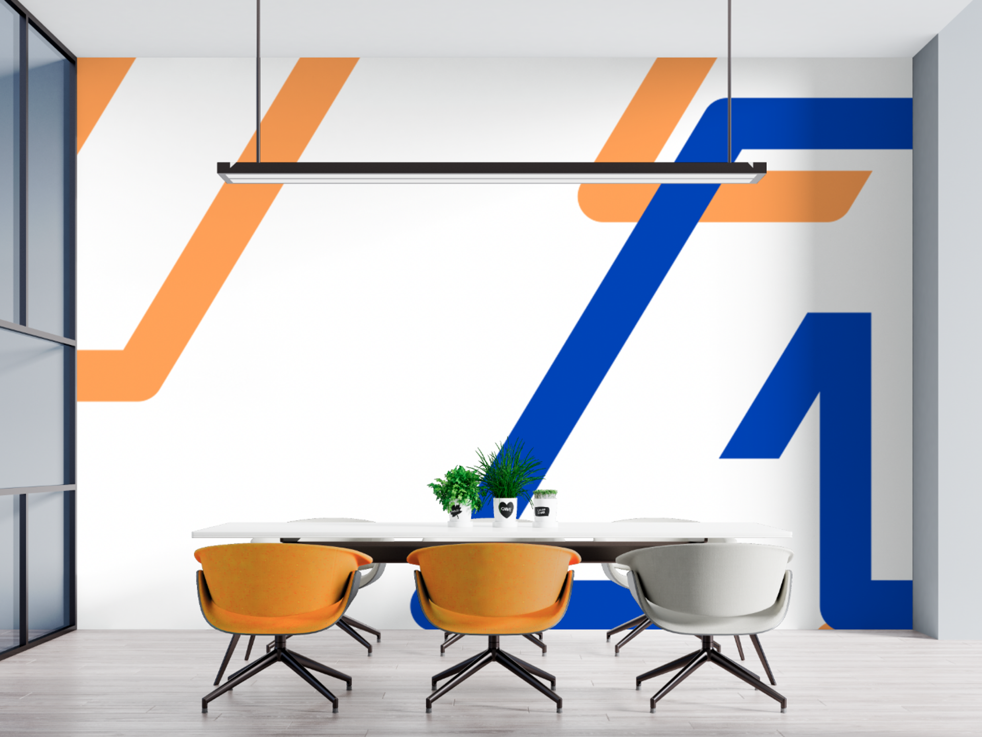
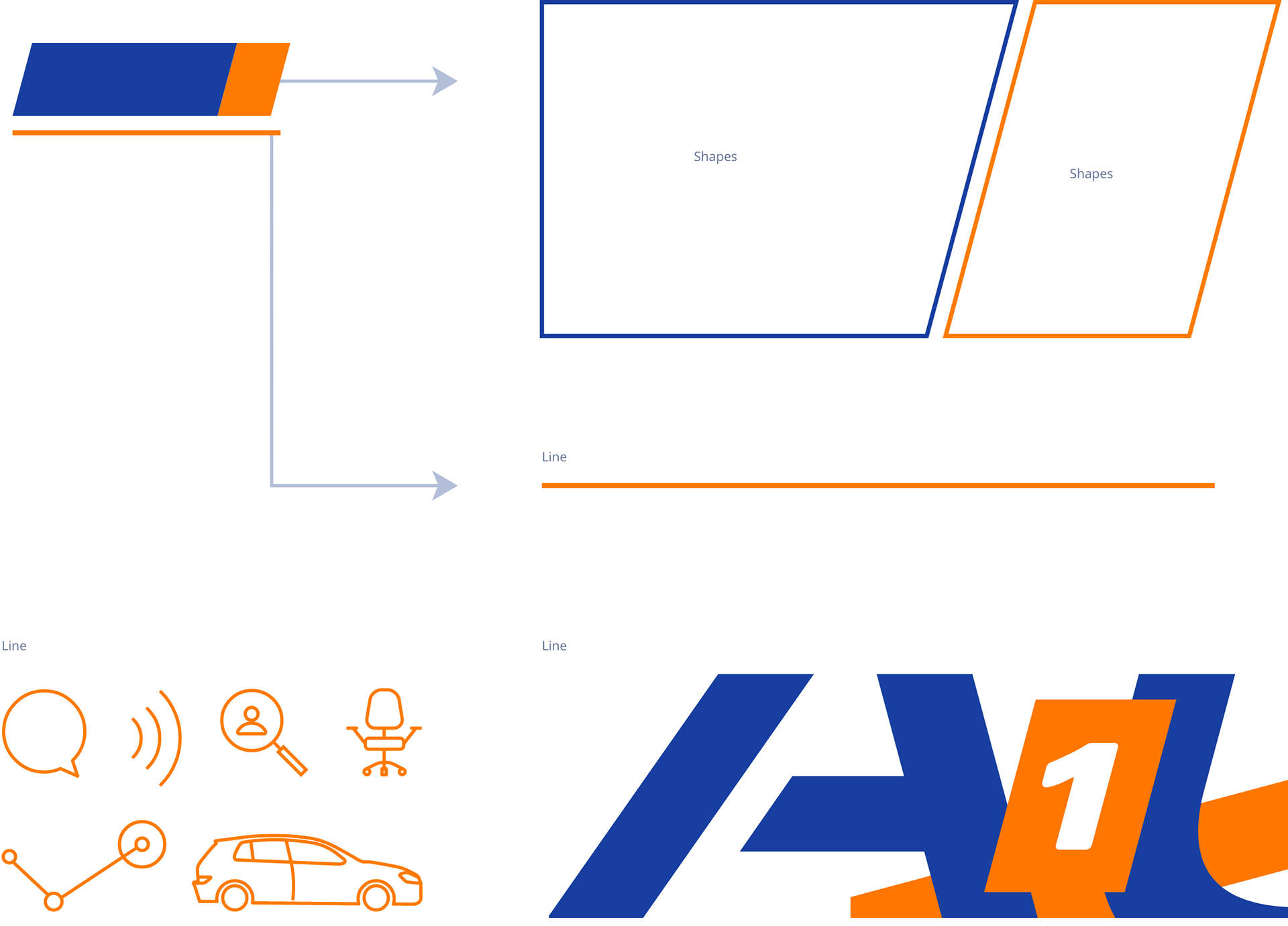
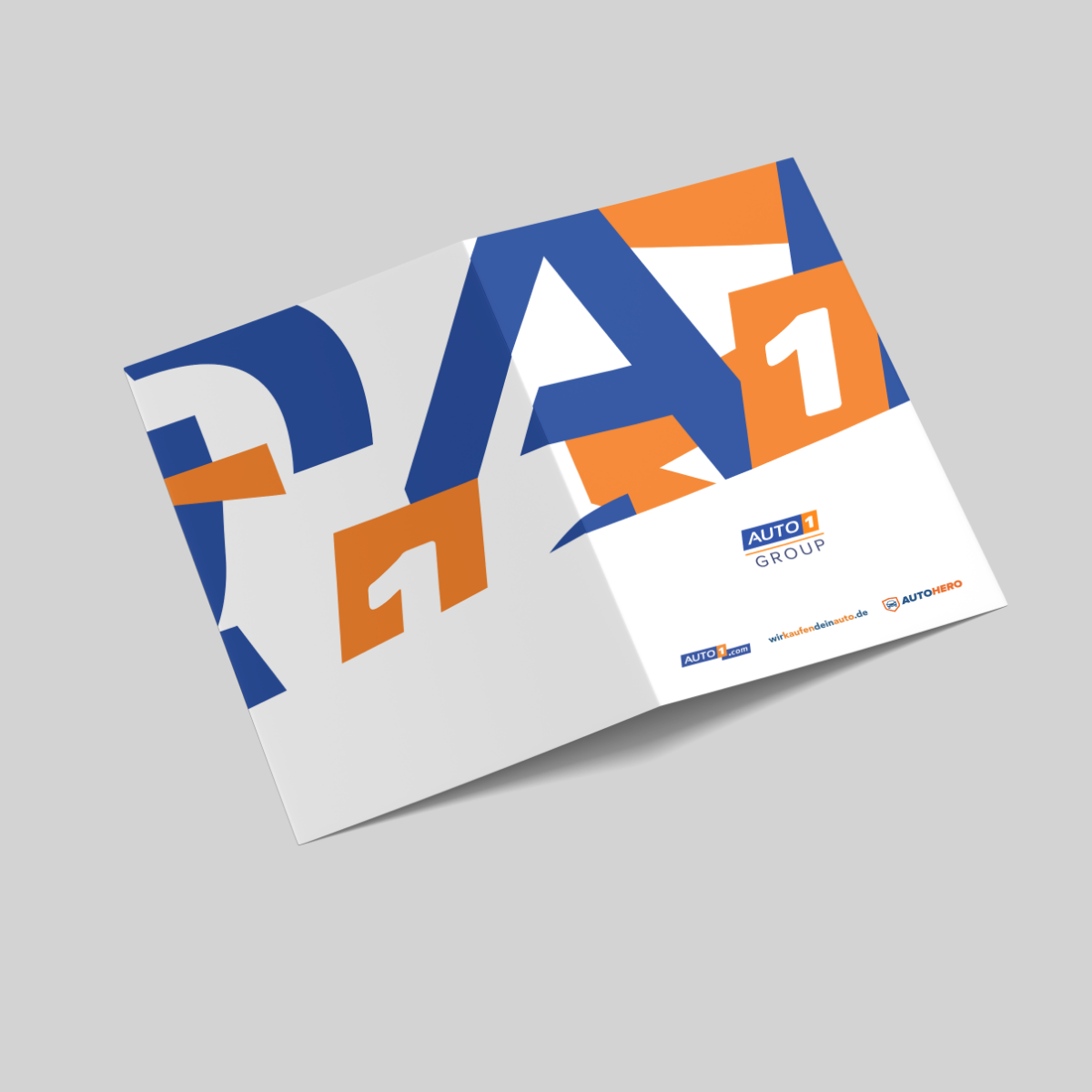
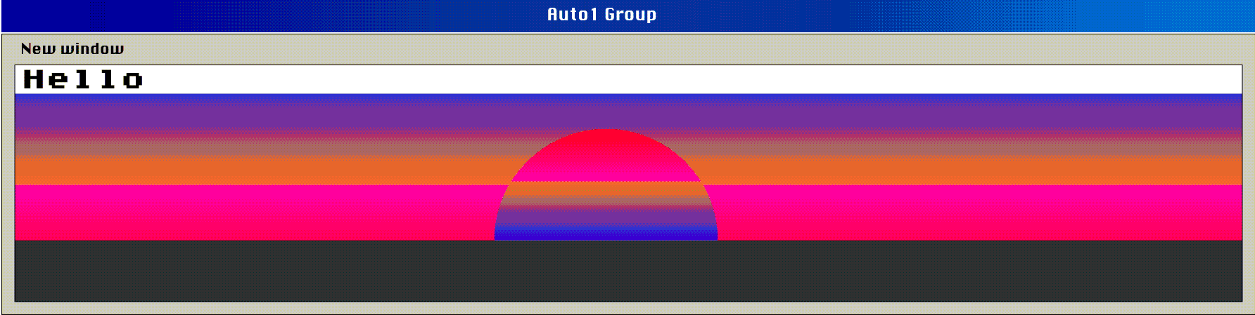
While exploring a visual footprint, I examined the logo with X-ray vision and discovered its potential. Its angular and dynamic shapes reflect the brand's dynamism and speed. The brand's visual identity was shaped by these elements, which inspired layouts and design patterns.
References
One aspect I would like to emphasize is the importance of having created a file containing design and layout references, which I could always consult to keep in mind how to combine different graphic elements. The file was also shared with another design member, and I kept adding ideas and resources.


4. Visual identity
- Since the company operates at a fast pace, I relied heavily on my intuition to anticipate how a single design request might develop into a whole series or campaign.
Using a practical example, I was able to determine what graphic elements performed best based on their ability to adapt to different platforms and grow with the brand.
Corporate
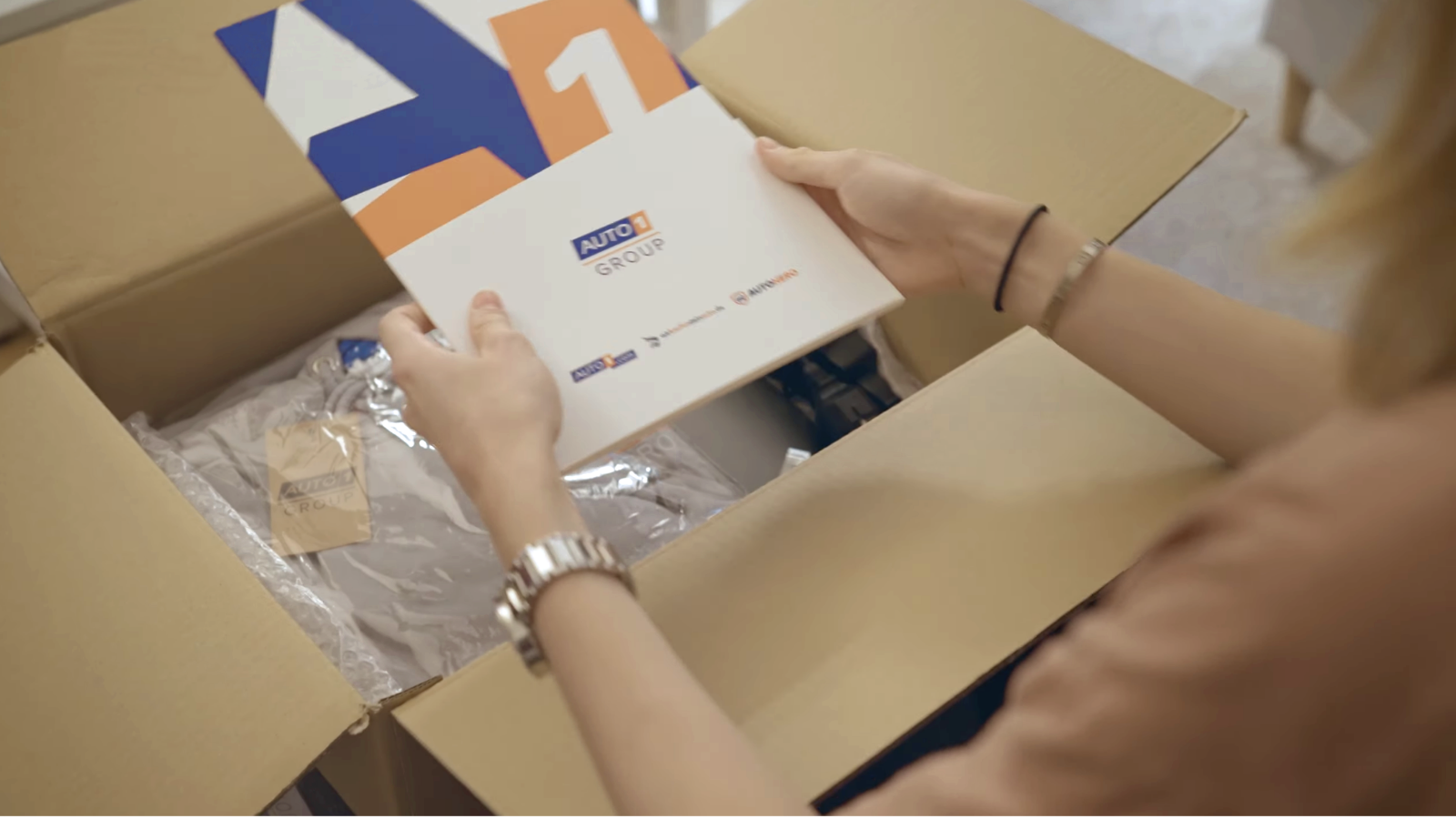
In phases, the corporate identity was implemented across departments in small steps. The departments differentiated themselves according to their functions while adhering to the brand essence.
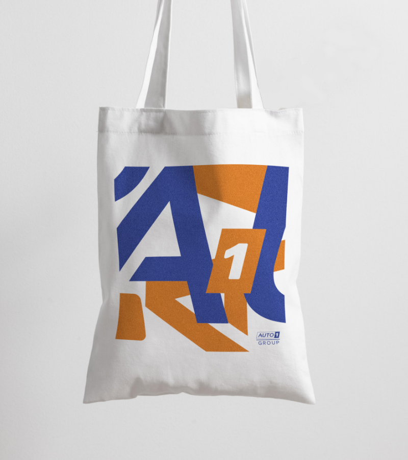
Graphic style and applications

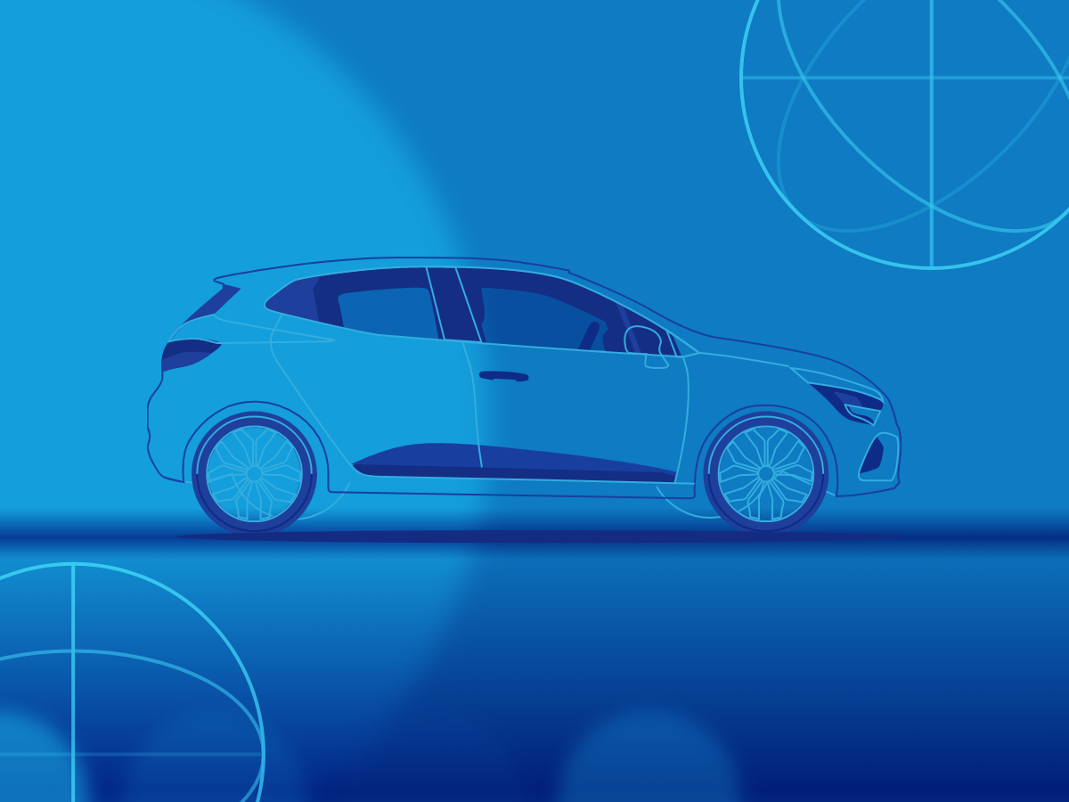
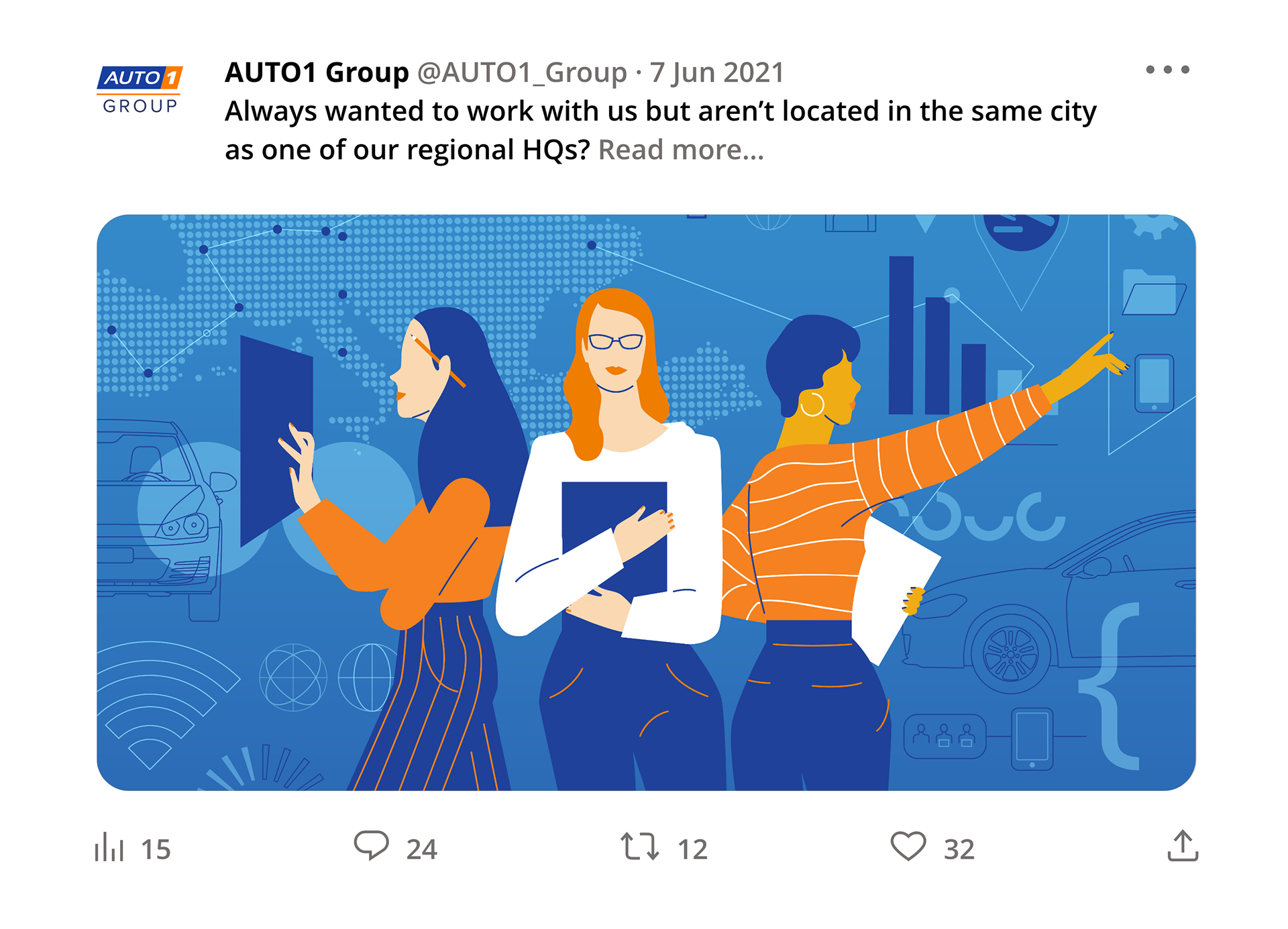
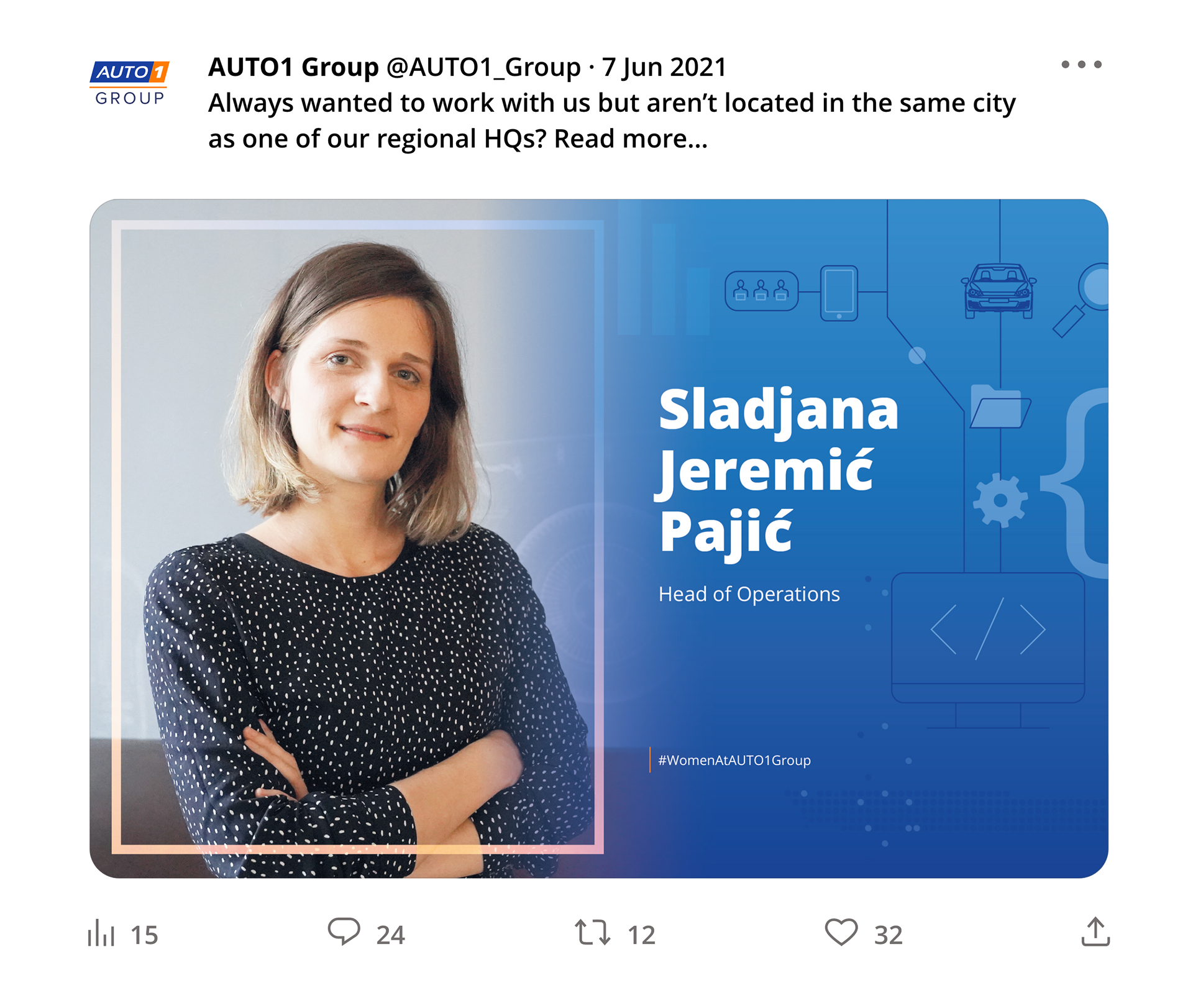
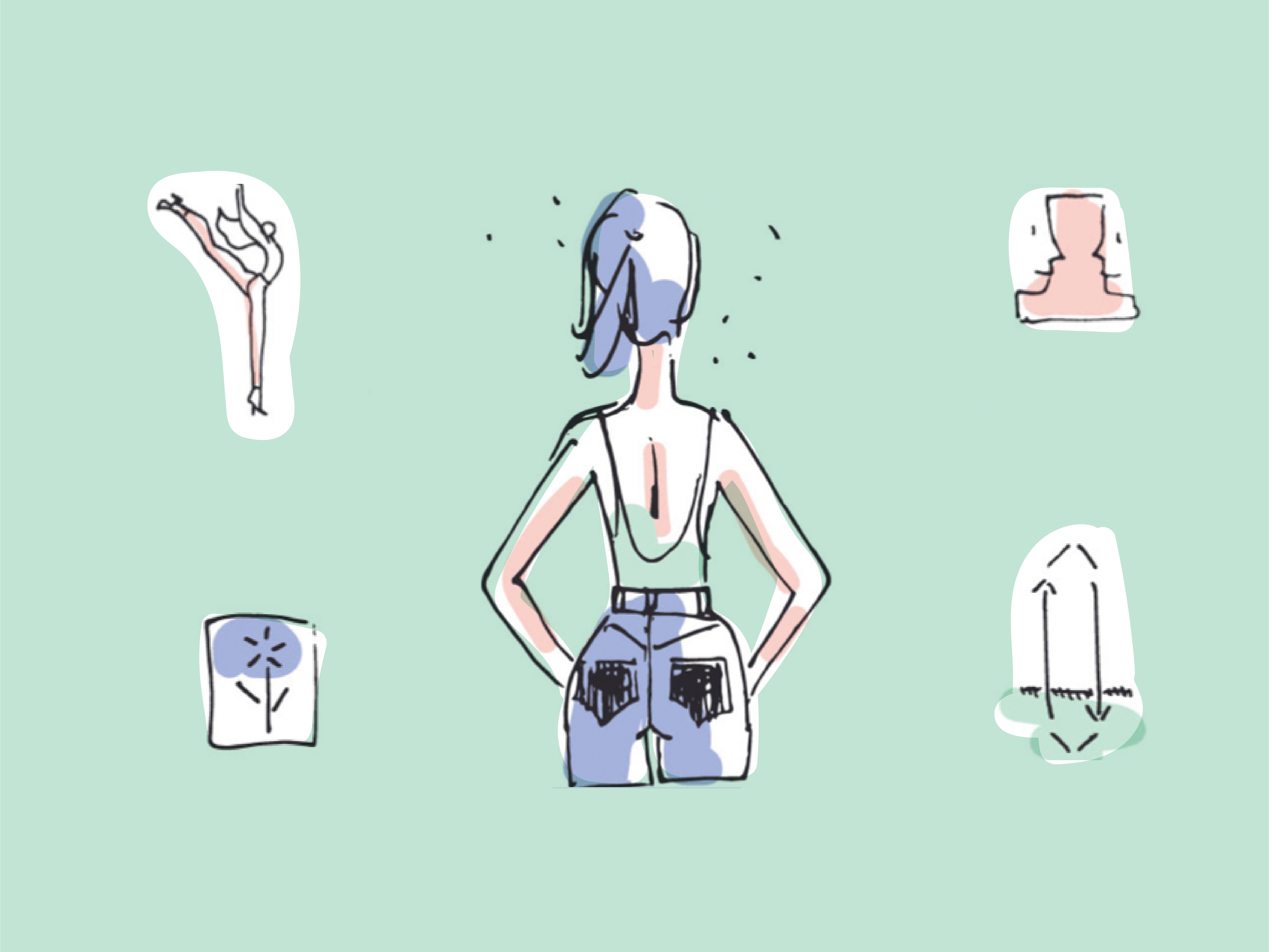
Illustrations


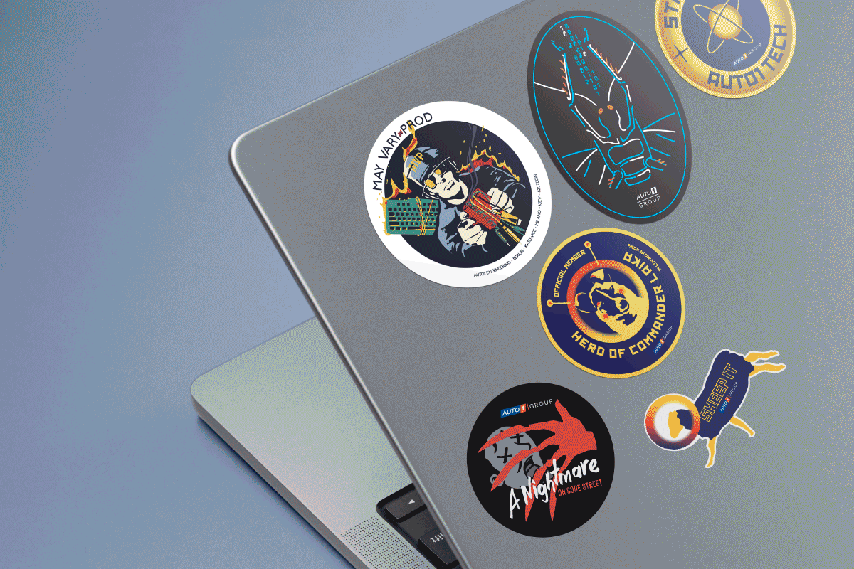
Auto libraries

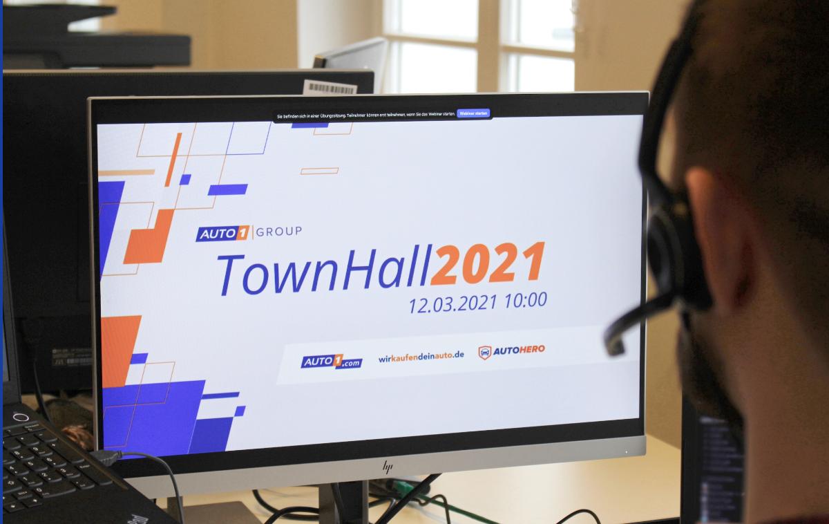
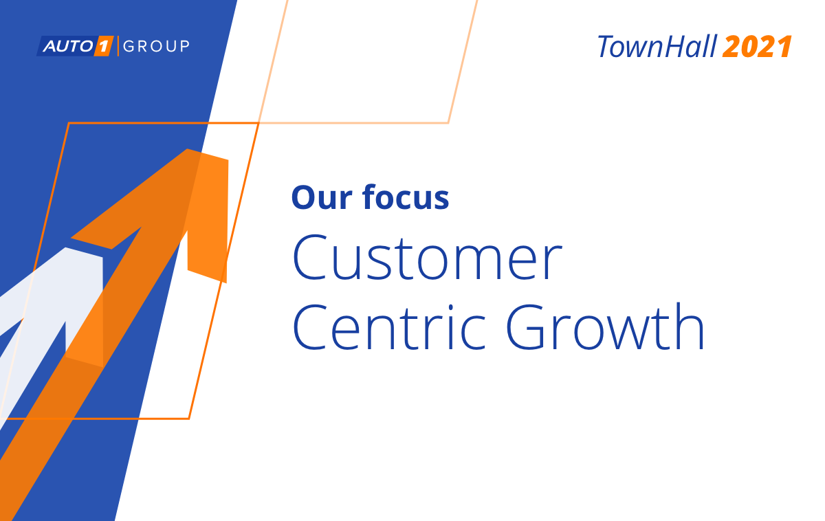
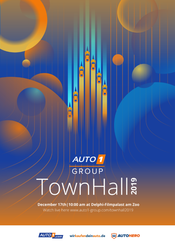
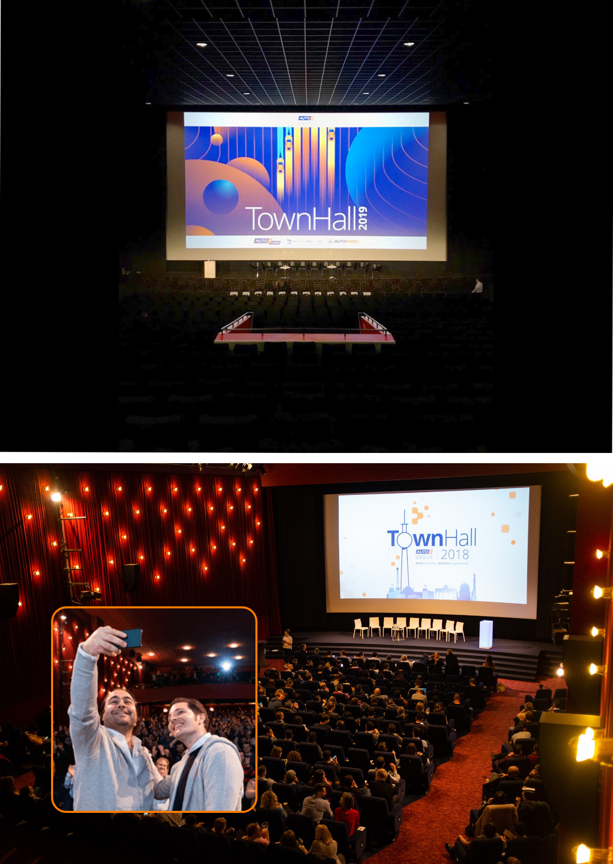
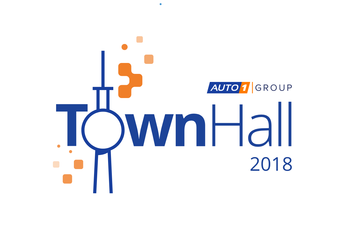
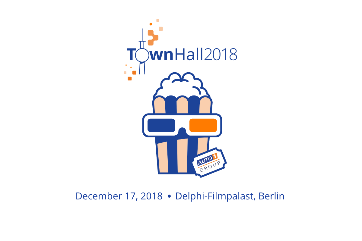
Townhalls
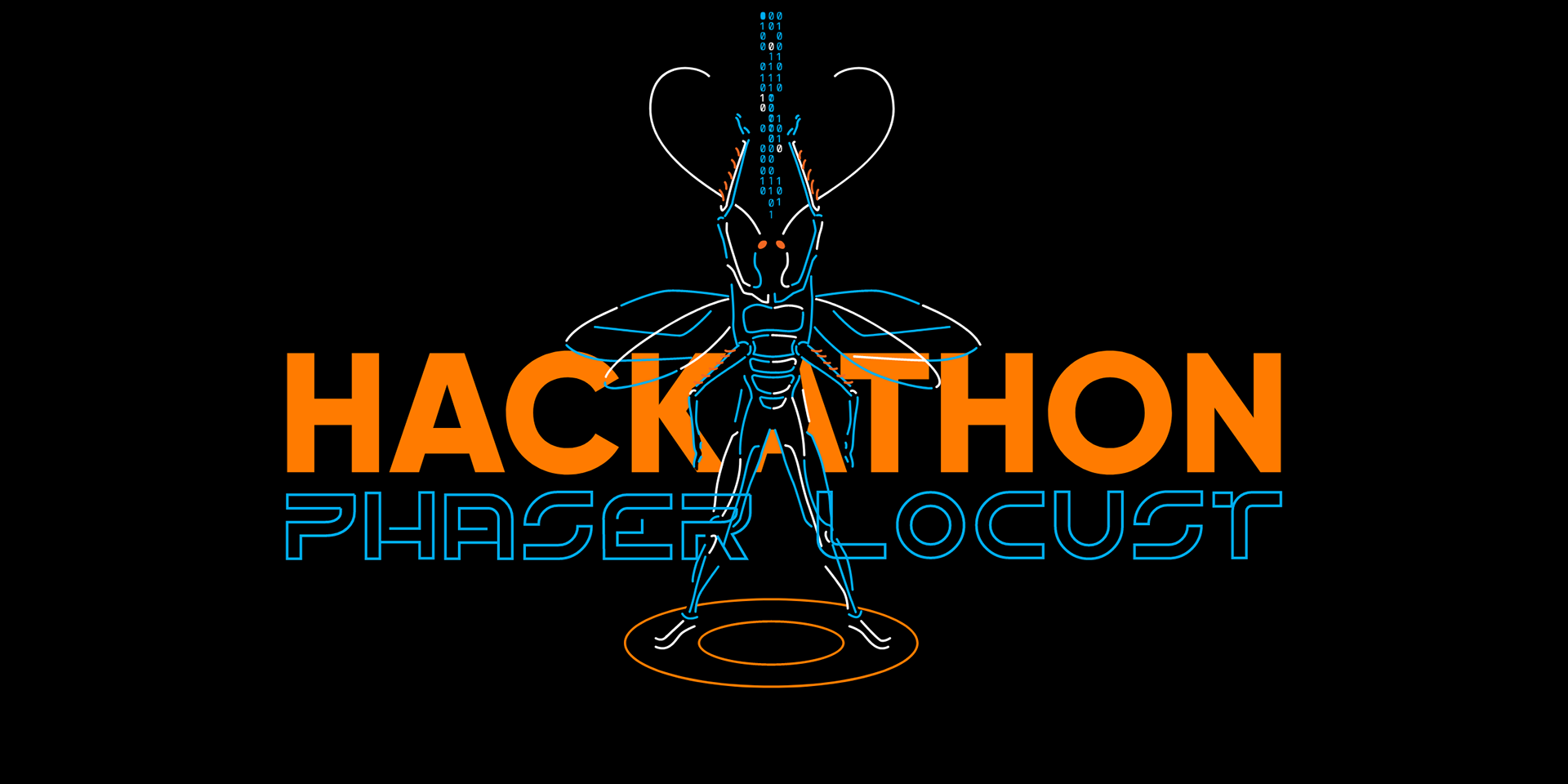
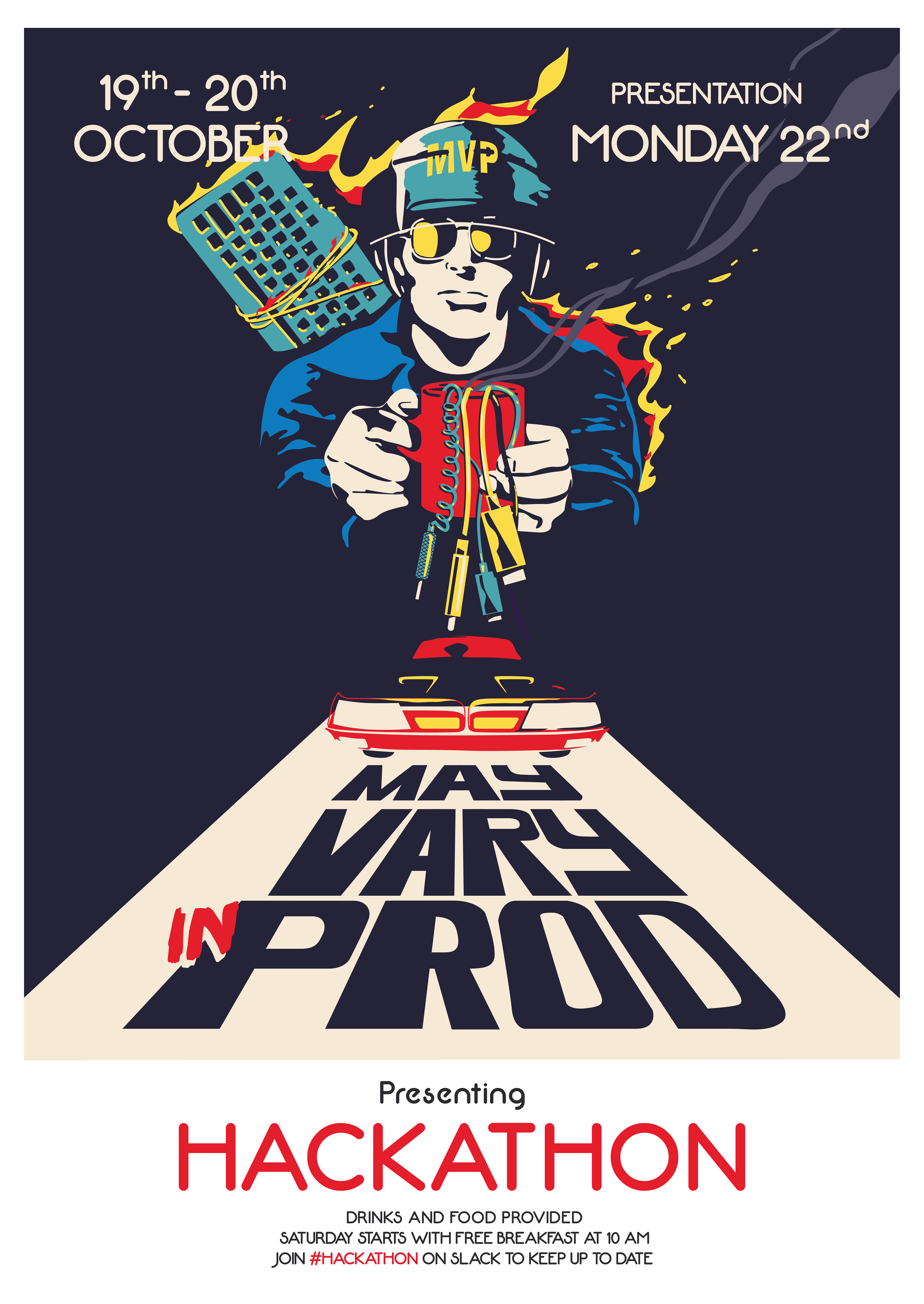
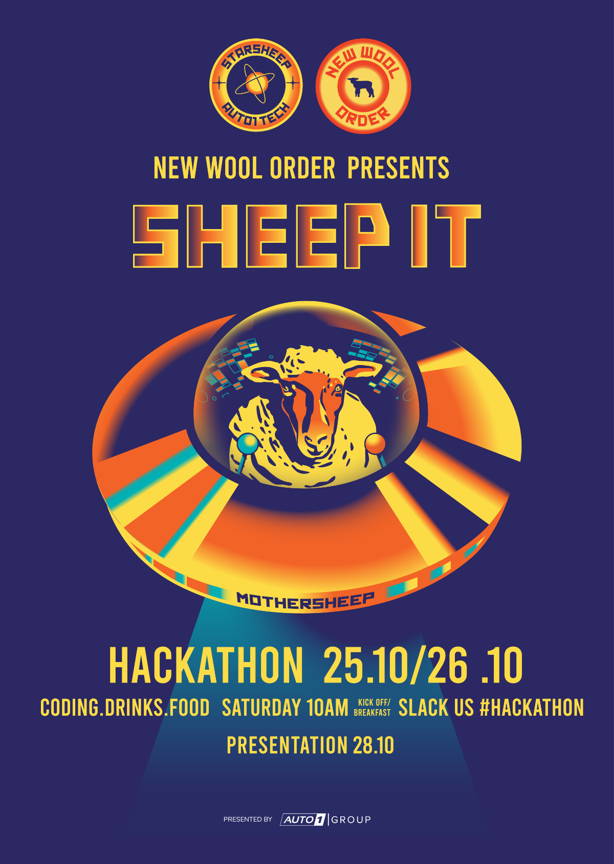
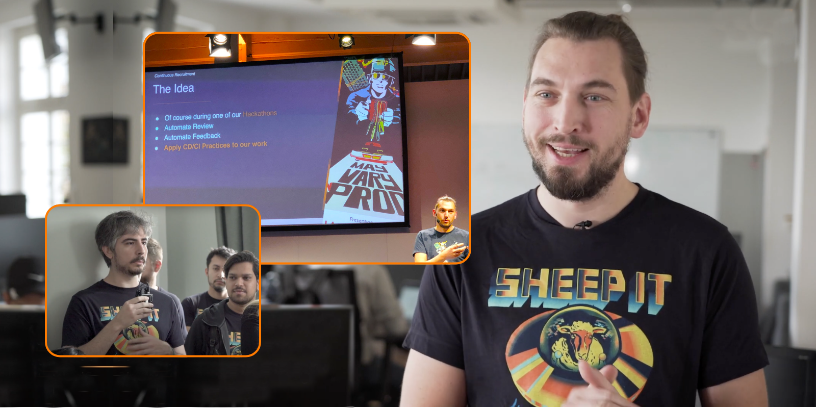
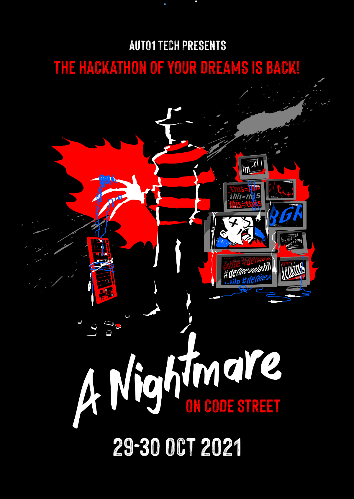
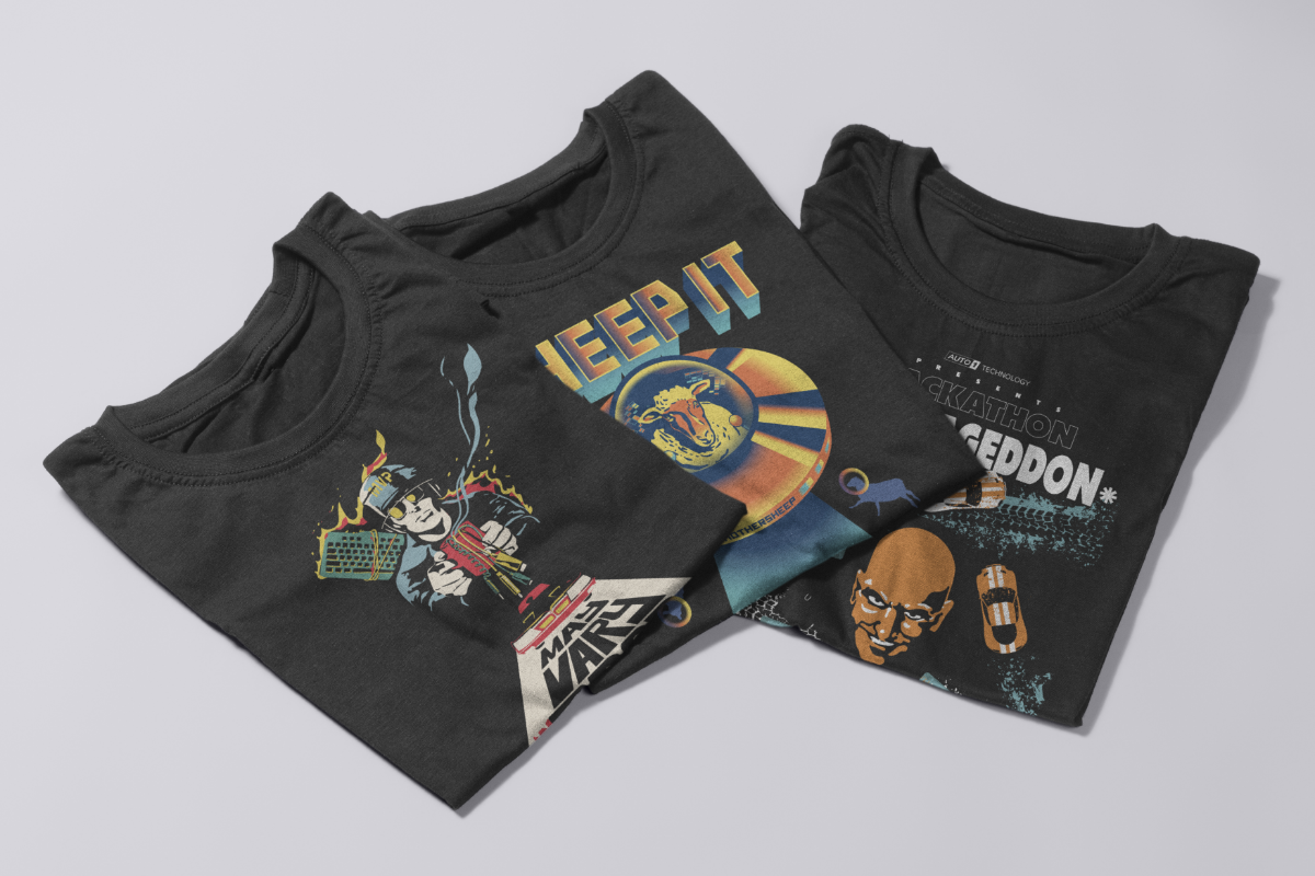
Hachathons
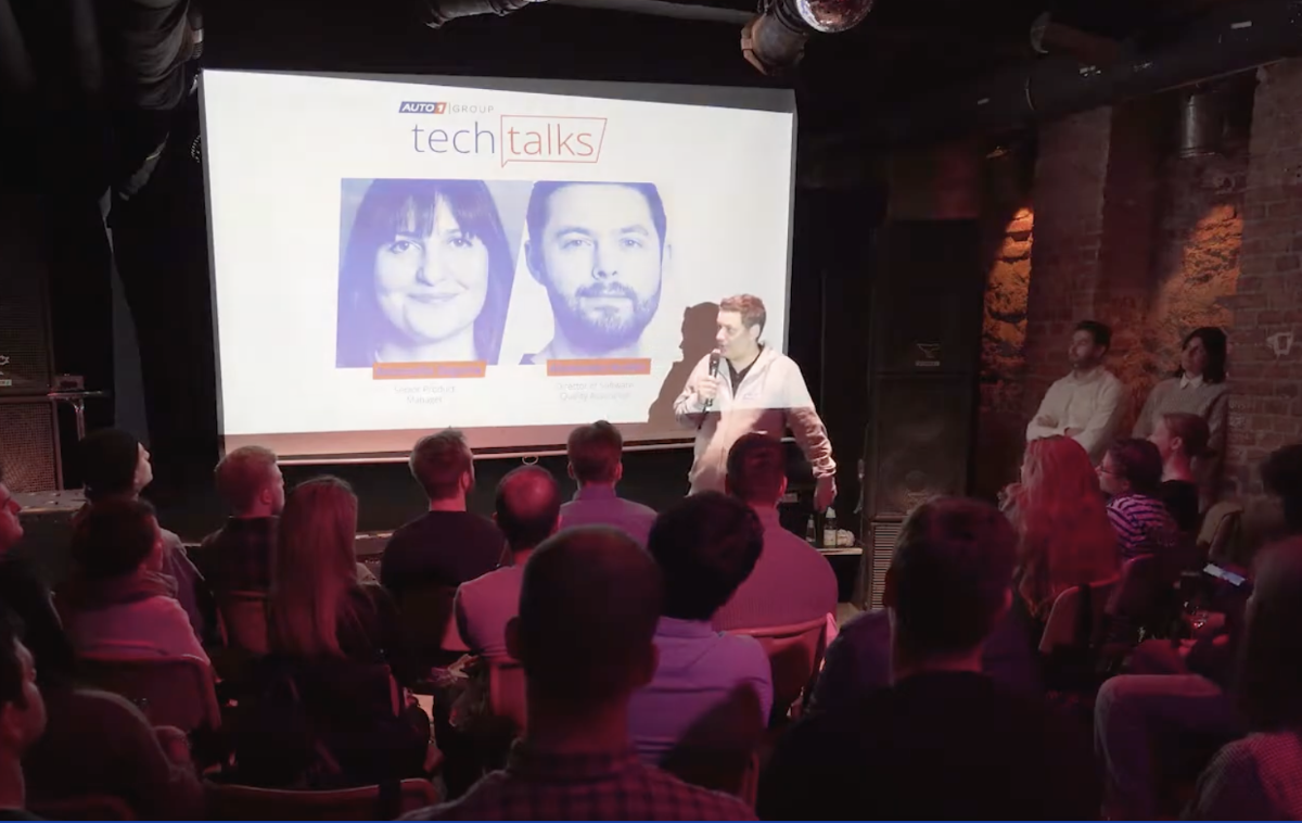
Tech talks
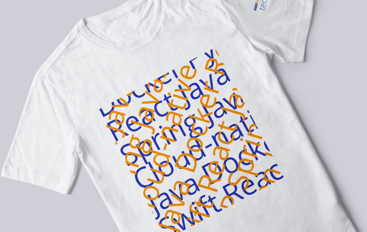
Tech Department
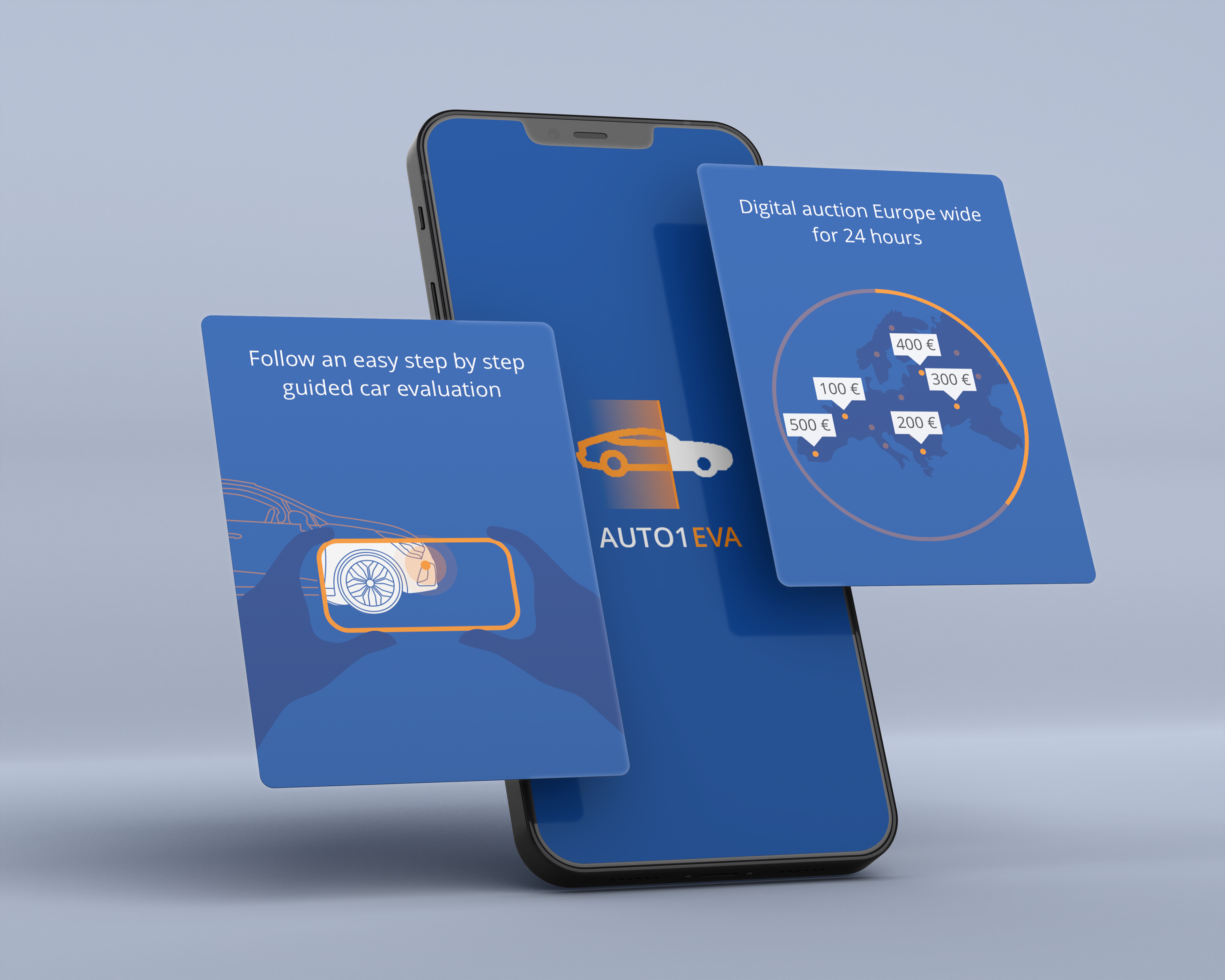
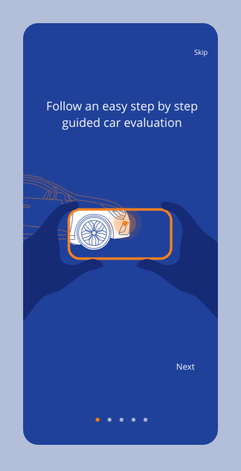
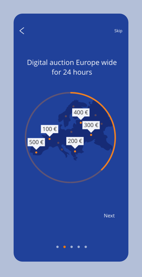
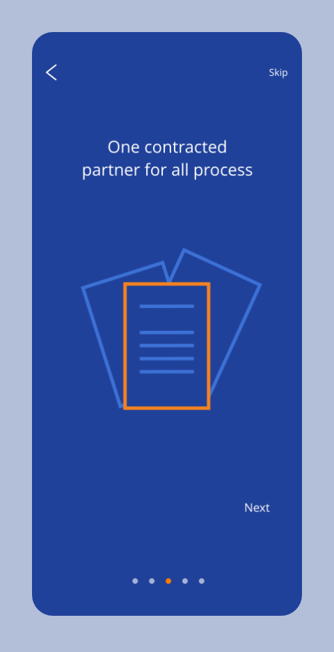
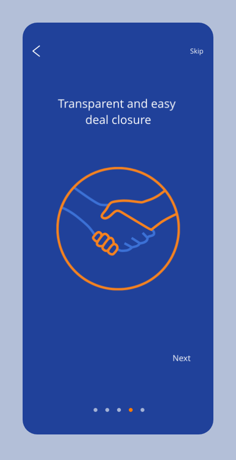
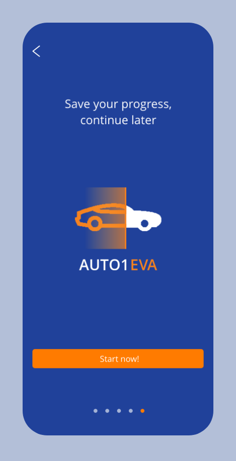
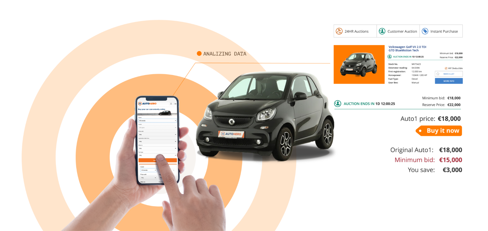
EVA App
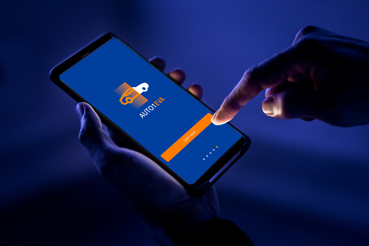
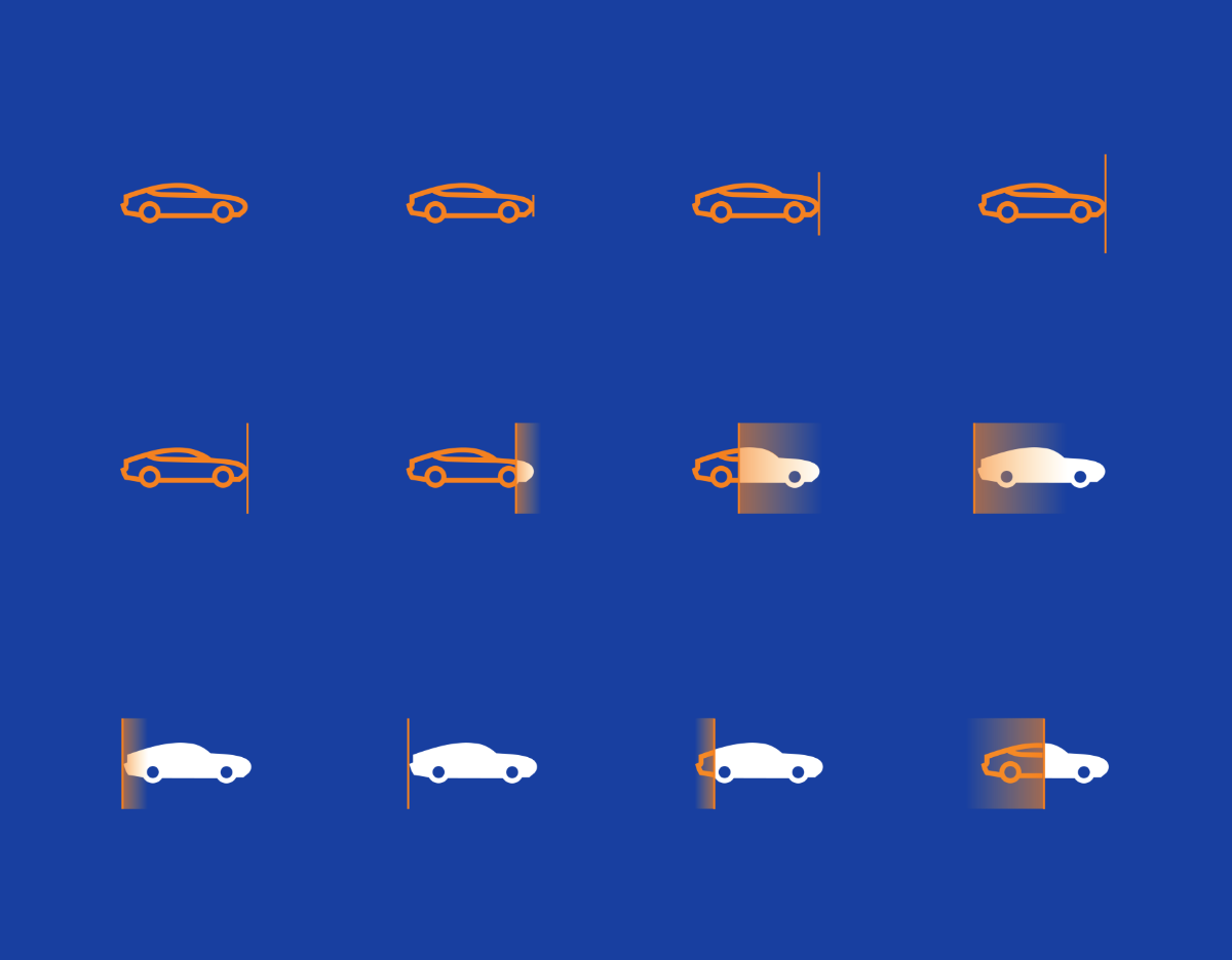
In close collaboration with Kate Baidachenko and the product design team, I developed concepts describing the top features of the EVA app. In the Splash Screen, I was responsible for providing the visual storyline/animation for each feature. My ideas were accompanied by a storyboard to facilitate the work of the animation team.
Below, at the right side, you will find an animation that I made for your reference.